Design Systems
A design system is the single source of truth for how your digital product looks and behaves. It saves time, prevents inconsistency, and means every designer or developer working on your product is working from the same page.
How this works
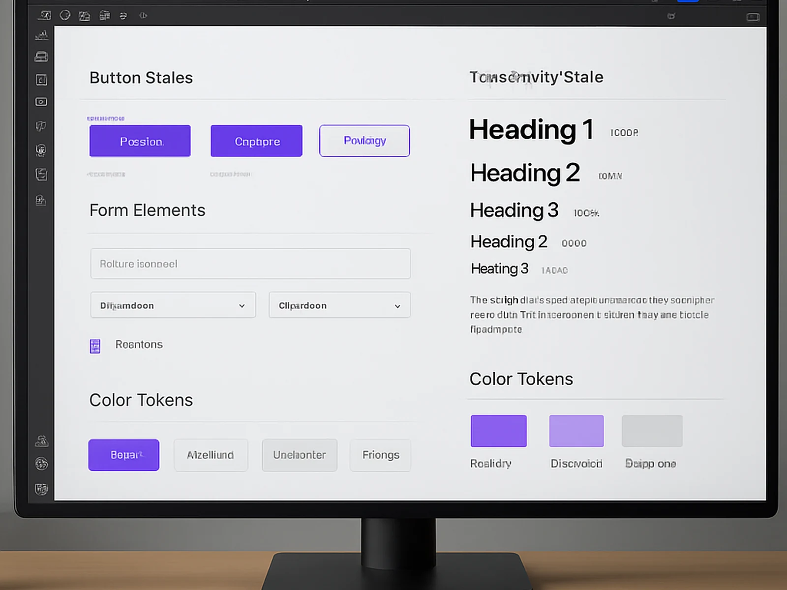
Design systems are the infrastructure layer of digital products. Without them, every new feature or page gets designed in isolation, leading to visual drift, inconsistency, and exponentially increasing maintenance costs over time. With a well-built system, new pages and features can be assembled from existing components rather than designed from scratch, reducing both design time and the risk of introducing inconsistency. Our design system work covers component library design (all UI elements from buttons and forms to navigation patterns and complex data displays), design tokens (the atomic values for colour, spacing, typography, shadow, and border radius that cascade through the entire system), documentation (usage guidelines, do and don not rules, and code-ready specifications), and handover material optimised for your development workflow whether that is Figma-to-code, Storybook integration, or a custom format. For organisations with existing products, we begin with an audit of current inconsistencies before building the system, ensuring the system reflects real usage patterns rather than an idealised but impractical version of the product.